Since 1936, Fiesta dinnerware has brought vibrant color and joy to American tables.
What makes Fiesta truly special isn’t just its bold hues or durable construction; it’s the brand’s philosophy that every color is designed to work harmoniously with every other color in the collection.
This intentional approach transforms your dinnerware from a matching set into a creative palette where you’re the artist.
Whether you’re a longtime collector or just discovering Fiesta’s rainbow of possibilities, learning to confidently mix and match colors can elevate your everyday meals and special occasions alike.
In this guide, you’ll discover the principles behind successful color combinations, practical strategies for different settings, and the confidence to create tablescapes that reflect your unique style.
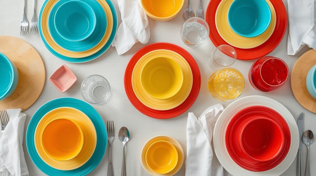
Understanding Fiesta’s Color System
Fiesta’s color journey spans nearly nine decades, with over 50 colors introduced throughout its history.
The original “Fiesta Five” from 1936—Red, Cobalt Blue, Light Green, Yellow, and Ivory—established the brand’s commitment to bold, saturated hues that could stand alone or work together.
Today’s collection includes both core colors that remain in production for years and limited-edition seasonal shades that create urgency among collectors.
The genius of Fiesta’s color system lies in its consistency. Each color is carefully formulated to maintain the same vibrancy across all piece sizes, from tiny salt shakers to large serving platters.
This uniformity makes mixing effortless because a Scarlet dinner plate will perfectly match a Scarlet mug, even if purchased years apart.
Understanding the distinction between vintage and contemporary pieces is crucial for collectors who want to mix eras.
The original Fiesta (1936-1973) featured different clay bodies and glazes than post-1986 pieces, which can affect how colors interact on the table.
If you’re interested in understanding the differences between vintage and modern Fiesta colors, you’ll discover how manufacturing changes have influenced color formulations over the decades.
Fiesta colors also have distinct undertones; some lean warm (with yellow or red bases) while others read cool (with blue or gray bases).
Turquoise and Peacock both fall in the blue-green family, but Turquoise has warmer, more balanced undertones while Peacock skews cooler and bluer.
Recognizing these subtle differences helps you create combinations that feel intentional rather than accidental.
Core Color Mixing Principles
Successful color mixing isn’t about memorizing rigid rules; it’s about understanding fundamental principles that guide your choices.
These time-tested approaches come from color theory but translate beautifully to table settings.
Complementary Colors: Drama and Contrast
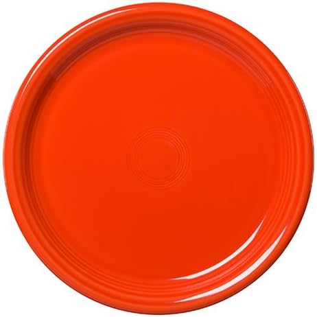
Complementary colors sit opposite each other on the color wheel, creating maximum visual impact. In Fiesta terms, think Turquoise paired with Poppy (orange-red), or Shamrock paired with Mulberry.
These combinations practically vibrate with energy, making them perfect for celebrations, outdoor dining, or any time you want your table to make a bold statement.
The key is balance. If you’re using two complementary colors, consider making one the dominant shade (about 60-70% of your place setting) and the other an accent.
For example, use Turquoise for dinner plates and bowls, then add Poppy salad plates and mugs.
Analogous Colors: Harmonious Flow
Analogous colors are neighbors on the color wheel, creating smooth transitions that feel naturally cohesive.
A trio like Sunflower (yellow), Butterscotch (golden orange), and Tangerine (bright orange) creates a sunset-inspired gradient that’s energetic yet harmonious.
These combinations work beautifully for casual gatherings and everyday use because they’re visually interesting without overwhelming.
The gradual color shift adds depth to your table while maintaining an overall sense of unity.
Monochromatic with Pops: Elegant Restraint
This approach uses neutral Fiesta colors—White, Ivory, or Slate—as your foundation, then adds one or two vibrant accent colors for visual interest. It’s sophisticated, versatile, and foolproof.
A base of White dinner plates and bowls with Lemongrass salad plates and Peacock mugs creates a fresh, modern look that works from breakfast to dinner parties.
The neutrals provide breathing room that prevents color fatigue, while your accent colors deliver personality.
This strategy is particularly smart for beginners or those who want maximum flexibility in their collection.
Triadic Combinations: Balanced Energy
Triadic color schemes use three colors evenly spaced around the color wheel. In Fiesta, you might combine Scarlet (red), Lemongrass (yellow-green), and Peacock (blue).
These combinations feel balanced and vibrant without one color dominating.
The trick is varying the proportions—use one color as your primary (largest pieces), another as secondary (medium pieces), and the third as an accent (small pieces or serving items).
This creates visual hierarchy while maintaining color balance.
The 60-30-10 Rule for Tables
Interior designers use the 60-30-10 rule to create balanced spaces, and it translates perfectly to table settings.
Choose a dominant color for 60% of your place setting (typically dinner plates and bowls), a secondary color for 30% (such as salad plates or mugs), and an accent color for 10% (bread plates, small bowls, or serving pieces).
This formula prevents visual chaos while ensuring every color has purpose.
For a deeper exploration of how each Fiesta color has evolved and how different shades work together, please explore our complete Fiestaware color guide for detailed histories and pairing suggestions.
Practical Mixing Strategies
Starting with Your Base Color
Every successful color combination needs an anchor, a base color that grounds your design.
The best anchors are either neutrals (White, Ivory, Slate) or colors you genuinely love and want to see at every meal.
If Turquoise makes you happy, make it your base and build around it. Your base color should appear in the largest pieces—dinner plates and bowls—because these create the most visual impact.
Once you’ve chosen your base, select 1-2 additional colors that complement it.
If your base is neutral, you have complete freedom with accent colors. If your base is bold, choose accents that either harmonize (analogous) or contrast (complementary), depending on the energy level you want.
Mixing by Occasion
Everyday Dining calls for simple, unfussy combinations. Stick to 2-3 colors maximum, with plenty of repetition.
A rotation of Slate dinner plates with White bowls and either Lemongrass or Peacock accent pieces creates an everyday palette that never feels boring.
The key is consistency; using the same basic formula makes setting the table quick while still feeling intentional.
Casual Entertaining invites more playfulness. This is where you can stretch to 3-4 colors and introduce more variety.
Try Sunflower dinner plates, Turquoise salad plates, Scarlet bowls, and White mugs. The additional colors create a festive, relaxed atmosphere that signals to guests this is a fun, informal gathering.
Don’t worry about perfect symmetry—casual settings can embrace happy accidents.
Formal Dinner Parties benefit from restraint and sophistication. Lean heavily on neutrals with one or two carefully chosen accent colors.
Slate dinner plates with Ivory salad plates and Claret wine glasses create an elegant, refined palette that won’t compete with your carefully prepared food.
Keep serving pieces consistent with your neutrals so they fade into the background, allowing individual place settings to shine.
Seasonal Color Stories
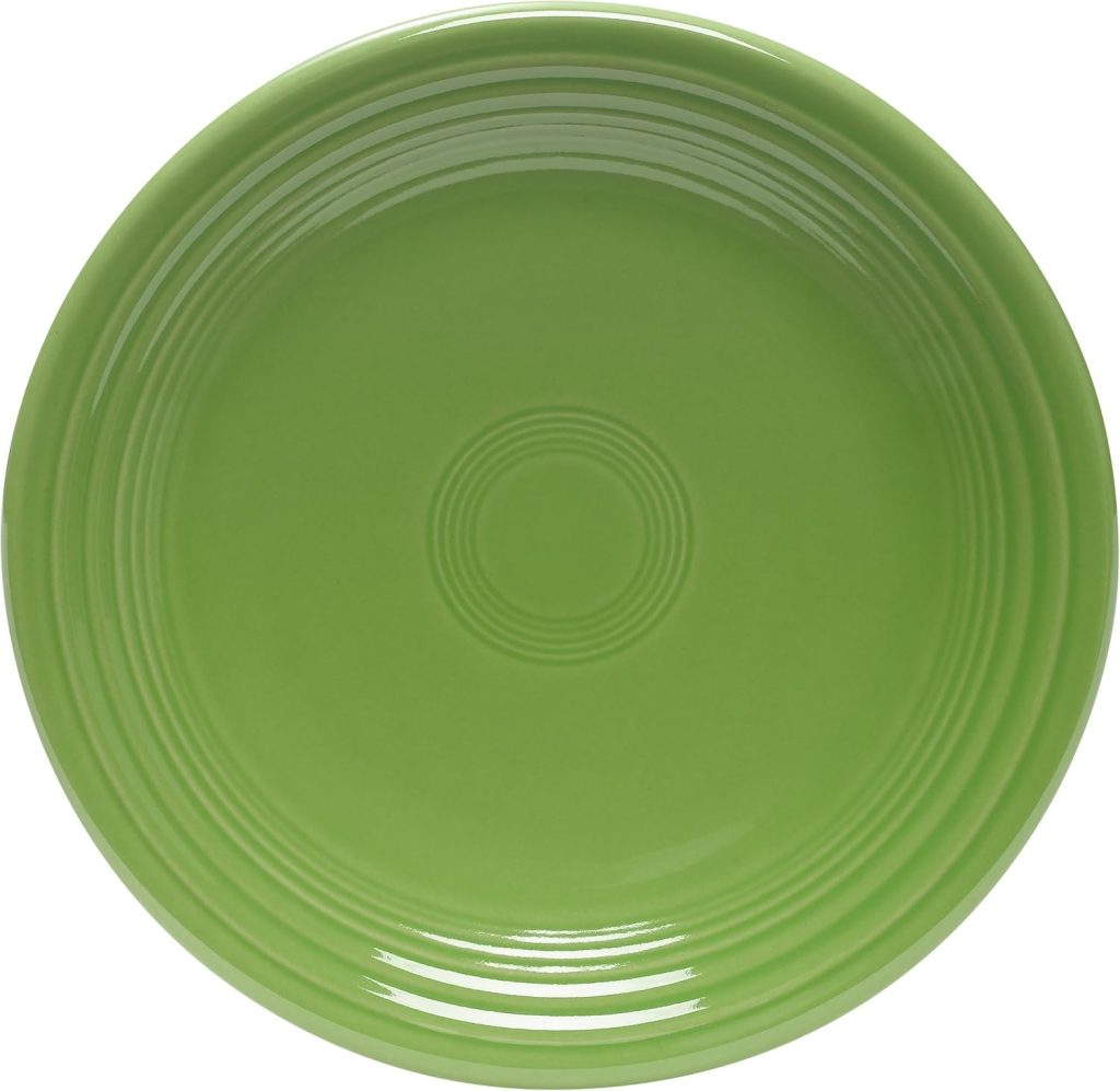
Spring welcomes renewal with fresh, optimistic combinations. Pair Lemongrass with White and soft Peacock for an Easter brunch, or combine Shamrock with Sunflower and Ivory for a garden party feel.
Spring palettes should feel light and energizing, like the season itself.
Summer embraces bold, saturated colors that celebrate sunshine and warmth.
Go all-in with Turquoise, Poppy, and Sunflower for a beach-themed dinner, or try Lemongrass, Tangerine, and White for a citrus-inspired tablescape.
Summer is the season to break out your most vibrant combinations without apology.
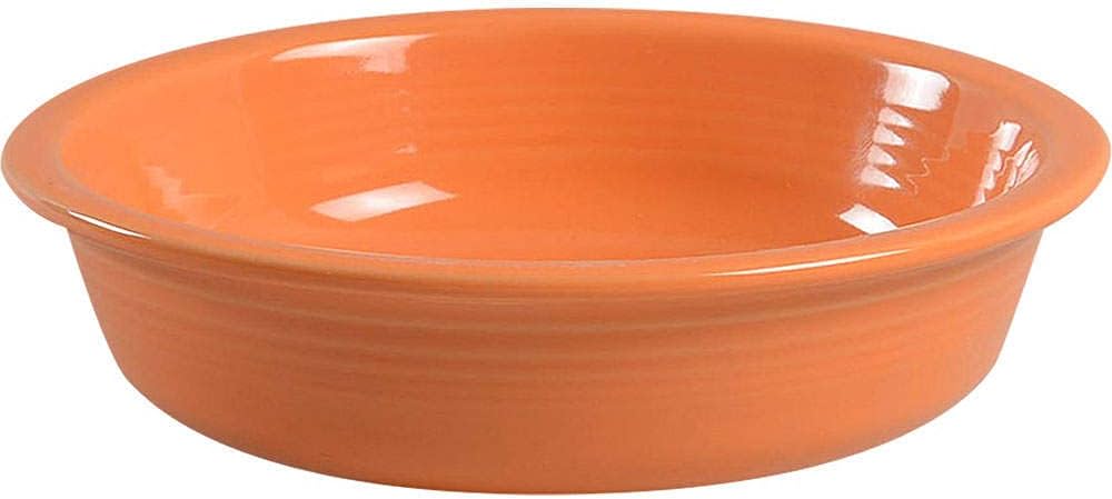
Fall shifts to warmer, earthier tones. Combine Paprika, Butterscotch, and Ivory for Thanksgiving, or pair Chocolate with Sunflower and Scarlet for a cozy autumn dinner.
These rich combinations mirror the changing leaves and create intimacy as days grow shorter.
Winter calls for either classic holiday combinations or sophisticated jewel tones. Scarlet and White is timeless for Christmas, while Slate, Mulberry, and Ivory create elegant winter dinner party vibes.
Don’t overlook darker colors like Plum and Claret; they feel luxurious and appropriate for long winter evenings.
The Hero Color Concept
Sometimes the most effective approach is letting one color dominate while others play supporting roles.
Choose your favorite Fiesta color as the “hero” and use it for 70-80% of your place setting.
Add just one accent color in small doses—perhaps a single salad plate or mug in a contrasting shade.
This creates a cohesive look with just enough variety to keep things interesting.
It’s also a smart strategy when you’re building your collection gradually, allowing you to fully invest in one color while experimenting with others.
Popular Color Combinations That Work
Classic Vintage Vibes
Turquoise + Scarlet + Sunflower: This trio channels Fiesta’s original spirit with colors that have been in the lineup (in various iterations) since the beginning.
The combination feels retro and cheerful, perfect for casual brunches or outdoor dining.
Use Turquoise as your base (60%), Scarlet as secondary (30%), and Sunflower as accent (10%) for balanced energy that never feels dated.
Modern Minimalist
Slate + White + Lemongrass. For contemporary aesthetics, this sophisticated palette delivers clean lines and calm sophistication.
Slate grounds the setting with its cool, neutral presence. White adds breathing room, and Lemongrass provides just enough color interest without overwhelming.
This combination photographs beautifully and works for everything from weekday dinners to dinner parties.
Sunset Romance
Poppy + Butterscotch + Paprika. All three colors share warm undertones, creating a gradient that evokes golden hour.
This analogous combination feels cohesive and intimate, perfect for date nights or fall entertaining.
The colors are distinct enough to create interest but similar enough to feel harmonious.
Ocean Breeze
Peacock + Turquoise + White. Two shades of blue-green with crisp White create a coastal, refreshing aesthetic.
While Peacock and Turquoise are both in the same color family, Peacock’s cooler, deeper tone provides contrast against Turquoise’s brighter warmth.
White keeps the combination from feeling too aquatic. Ideal for summer meals and seafood dinners.
Garden Party
Shamrock + Sunflower + Ivory. This spring-perfect combination pairs fresh green with cheerful yellow, softened by warm Ivory.
It’s optimistic without being childish, making it suitable for everything from baby showers to Sunday brunch.
The three colors have similar saturation levels, which helps them feel balanced.
Berry Medley
Mulberry + Claret + Plum. For something unexpected, this monochromatic purple palette creates drama and sophistication.
Using three shades of purple from the same color family demonstrates that mixing doesn’t always require contrasting colors.
Add White or Ivory serving pieces to prevent the look from feeling too heavy.
Citrus Fresh
Lemongrass + Tangerine + White. Bright, energizing, and modern, this combination channels sunny optimism.
The yellow-green and orange create a complementary relationship that’s softened by White.
Perfect for breakfast, summer gatherings, or any time you need an energy boost from your surroundings.
Southwest Warmth
Paprika + Turquoise + Sunflower. This classic Southwestern palette combines earthy terracotta-red with vibrant turquoise and golden yellow.
It’s bold and distinctive with cultural resonance, making it ideal for Mexican-inspired meals or outdoor entertaining.
The three colors have roughly equal visual weight, so distribute them evenly across your place settings.
Common Mistakes to Avoid
Even with Fiesta’s forgiving palette, certain missteps can undermine your tablescapes. The most common error is using too many bright colors without a neutral anchor.
When every piece screams for attention, the overall effect becomes chaotic rather than cheerful. Your eye needs somewhere to rest, which is why neutrals are essential in most combinations.
Ignoring undertones creates unintentional discord. Mixing warm colors (Paprika, Butterscotch) with cool colors (Peacock, Slate) requires intention.
Without a unifying element like White or Ivory, these combinations can feel jarring. If you’re mixing warm and cool, use one temperature as dominant (70%+) and the other as a small accent.
Another pitfall is using every color you own simply because you can. Just because Fiesta colors work together doesn’t mean all 12 of your colors should appear at once.
Restraint creates sophistication. Select a focused palette for each table setting, then rotate which colors you feature for different occasions.
Don’t forget about serving pieces in your planning. That beautiful three-color place setting can look muddled when you add serving bowls and platters in three more colors.
Keep serving pieces neutral or consistent with your main palette.
Finally, avoid being so rigid that you lose the joy of mixing. These are guidelines, not commandments. If a combination makes you happy, it’s successful—even if it breaks traditional color theory.
Trust your instincts and remember that Fiesta was designed for playful experimentation.
Building Your Collection Strategically
For Beginners: Establishing Your Foundation
Start with a complete set in one versatile color—White, Ivory, or a neutral like Slate. This gives you a fully functional dinnerware set while providing a blank canvas for future additions.
Next, add a complete set of one bold color you love in just one piece type (perhaps salad plates in Turquoise).
This instantly creates a two-color combination without requiring significant investment. Your third addition should be a complementary or contrasting accent color in a small piece—maybe bowls in Poppy or mugs in Lemongrass.
With just three strategic color purchases, you’ve created multiple mixing possibilities.
For Growing Collections: Strategic Expansion
Once you have your foundation, identify gaps rather than duplicating what you already own. If you have dinner plates in three colors but only mugs in one, focus on adding mug colors.
This approach maximizes your mixing options with each purchase. Consider which colors offer the most versatility—discover which Fiesta colors are most beloved by collectors to understand which shades provide the most pairing potential for your investment.
Seasonal sales and discontinued color announcements are opportunities to add colors at reduced prices.
When Fiesta retires a color, pieces often go on sale, making it an excellent time to experiment with a shade you’ve been curious about.
Secondhand shops, estate sales, and online marketplaces can yield vintage pieces at reasonable prices, though you’ll want to understand authentication basics before investing in older colors.
Mix Vintage with Modern Thoughtfully
Vintage Fiesta has a devoted following, and many collectors enjoy combining old and new pieces. The key is managing expectations about perfect matches.
Vintage Red differs slightly from current Scarlet; vintage Ivory has a different undertone than modern Ivory.
However, these variations can add depth and character to your table rather than detracting from it.
When mixing eras, embrace the slight differences as part of your table’s story rather than viewing them as imperfections.
Styling Beyond the Dinnerware
Your Fiesta color choices don’t exist in isolation; they interact with every element on your table. Table linens provide either contrast or harmony, depending on your goals.
With bold Fiesta combinations, solid-colored linens in neutral tones (white, cream, gray, natural linen) allow your dinnerware to star.
If your Fiesta palette is restrained (perhaps all neutrals with one accent), you might introduce patterned napkins that echo your accent color.
Glassware is best kept simple.
Clear glass disappears visually, allowing your Fiesta colors to dominate.
Colored glassware can work if it exactly matches one of your Fiesta colors, but mismatched colored glass often muddies the overall palette. When in doubt, go clear.
Flatware offers a surprising impact on how your colors read.
Stainless steel is the safe, neutral choice that works with everything.
However, gold-toned flatware adds warmth that complements colors like Paprika, Butterscotch, and Sunflower.
Black flatware creates a modern contrast that works beautifully with Slate and White combinations. Copper or rose gold brings out the warmth in Turquoise and Peacock.
Consider flatware as part of your overall color story, not a separate decision.
Centerpieces should enhance rather than compete with your dinnerware. Fresh flowers in colors that echo your Fiesta palette create cohesion—white and yellow flowers with a Sunflower and White table setting, for example.
Candles in neutral colors (white, ivory, gray) add ambiance without color conflict.
Resist the urge to add too many decorative elements; Fiesta’s bold colors provide plenty of visual interest on their own.
Conclusion
Mixing and matching Fiesta dinnerware colors transforms everyday dining into an opportunity for creative expression.
By understanding basic color principles, complementary contrasts, analogous harmonies, and the grounding power of neutrals, you can confidently create tablescapes that reflect your personality and occasion.
Remember that Fiesta was designed with mixing in mind; every color in the collection is formulated to work with every other color.
Start simple with a neutral base and one or two accent colors. As your confidence and collection grow, experiment with bolder combinations and seasonal rotations.
Pay attention to what brings you joy—the combinations that make you smile when you set the table are the ones worth repeating.
Trust your instincts over rigid rules, embrace the playful spirit that has defined Fiesta for nearly 90 years, and remember that the best table setting is the one that makes your meals more delightful.
This week, challenge yourself to try one new color combination, even if you’re just swapping out salad plates or mugs.
You might discover your new favorite palette, and at minimum, you’ll bring fresh energy to your table.
After all, that’s what Fiesta has been encouraging since 1936—more color, more joy, more personality in the everyday ritual of gathering around the table.