Walk into any vintage shop or scroll through collector forums, and you’ll notice certain Fiesta colors consistently selling out, commanding premium prices, or generating the most excitement.
Cobalt blue flies off shelves. Turquoise pieces spark bidding wars. Peacock creates instant nostalgia for 2000s décor lovers. But what makes some hues more coveted than others?
For new collectors, the question is practical: which colors should you invest in? Do popular colors hold their value better?
Which shades work best for everyday use versus display-only collecting? With over 50 colors released across Fiesta’s history, choosing where to focus your collection or even which color to buy for your table can feel overwhelming.
This article reveals the most popular Fiesta colors across both vintage and modern eras, explains what drives their enduring desirability, and helps you decide which shades deserve a place in your home.
Whether you’re building a serious collection or simply want dishes that bring joy to your daily meals, understanding color popularity is your roadmap to smart, satisfying choices.
What Makes a Fiesta Color “Popular”?
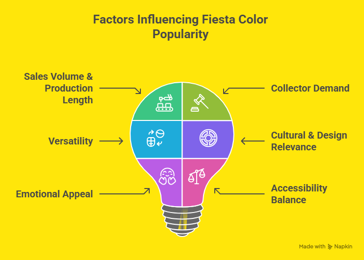
Before diving into specific colors, it’s important to understand what “popular” actually means in the Fiesta world. Popularity isn’t just about rarity or price; it’s a complex mix of factors:
Sales Volume & Production Length – Colors that remained in production for decades earned their status through proven appeal. Long runs mean Homer Laughlin kept making them because people kept buying them.
Collector Demand – Secondary market activity tells the story. Colors that generate active bidding, appear frequently in “most wanted” lists, and maintain strong resale values demonstrate genuine collector passion.
Versatility – The most popular colors tend to be excellent mixers, working harmoniously with many other hues and fitting multiple decorating styles from traditional to contemporary.
Cultural & Design Relevance – Colors that captured their era’s zeitgeist (like 1950s chartreuse or 2000s peacock) achieve iconic status that transcends mere aesthetics.
Emotional Appeal – Some colors simply make people happy. The psychological response to certain shades of the cheerfulness of yellow, the calm of turquoise, and the sophistication of mulberry drives their popularity.
Accessibility Balance – Interestingly, the most popular colors often hit a sweet spot: desirable but not impossible to find. Ultra-rare colors may be valuable, but they’re not necessarily the most beloved for everyday collecting and use.
Understanding these factors helps explain why certain colors maintain devoted followings decades after their introduction and why some modern colors instantly become classics.
The Timeless Classics: Most Popular Vintage Colors
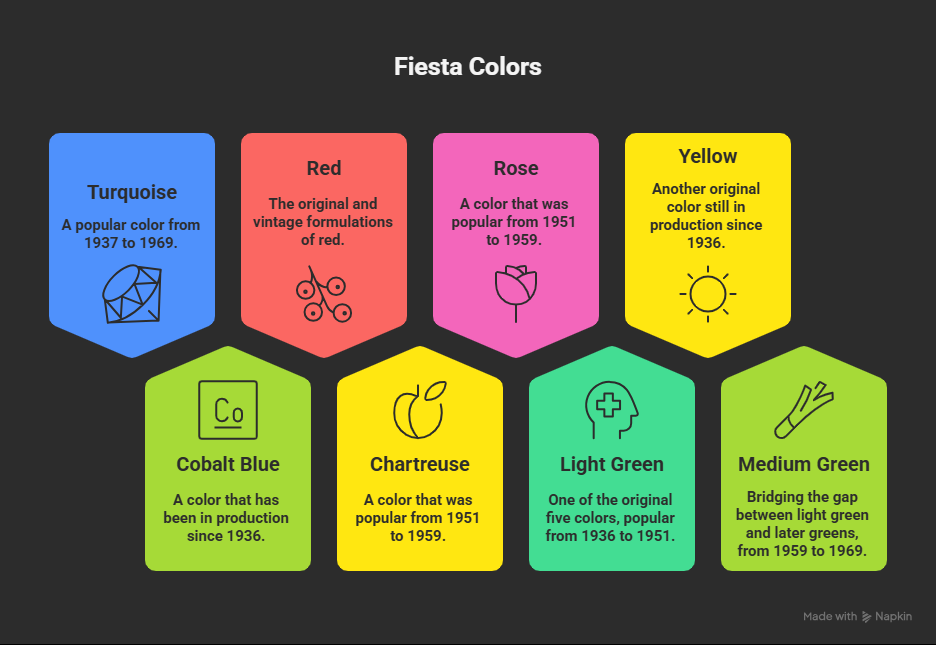
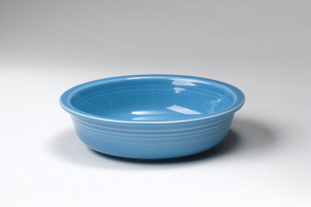
Turquoise (1937-1969)
If there’s one color that defines vintage Fiesta for most collectors, it’s turquoise. Introduced just a year after the original launch, this vibrant blue-green quickly became a phenomenon.
Its appeal is multifaceted: the color perfectly captures 1950s nostalgia (even though it debuted in the 30s), it’s incredibly versatile for mixing with other colors, and its long production run means it’s still relatively available on the secondary market.
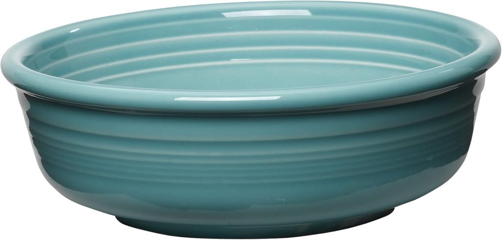
Turquoise works beautifully with warm tones like red and yellow, cool shades like cobalt, and even neutrals like ivory and gray.
Its balanced position between blue and green gives it unique flexibility that few other colors can match. For vintage collectors, turquoise is often the gateway color, the shade that starts the addiction.
Despite its 32-year production run making it more available than some rarer colors, demand has never waned. It consistently commands respectable prices and remains the first color many new collectors seek.
Cobalt Blue (1936-Present)
Cobalt blue holds a distinction no other color can claim: it’s the only shade from the original 1936 lineup still in continuous production today.
This deep, saturated blue has remained popular for nearly 90 years for good reason. It’s bold without being overwhelming, classic without being boring, and it works with virtually every other Fiesta color ever made.
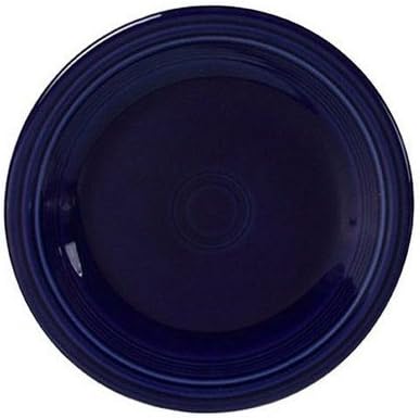
The color’s staying power speaks volumes. While design trends have shifted dramatically since 1936 through Art Deco, mid-century modern, postmodern, and contemporary styles, cobalt blue has remained relevant.
It anchors a collection, provides dramatic contrast, and serves as both an everyday workhorse and a showpiece.
Collectors love that they can mix vintage 1930s cobalt pieces with brand-new ones, creating a table that spans nine decades. Its universal appeal makes it the safest bet for anyone starting a Fiesta collection.
Red (Original/Vintage Formulations)
No Fiesta color has generated more intrigue than the original red. Produced from 1936 to 1943 using uranium oxide (yes, it’s actually radioactive), this iconic shade has achieved legendary status among collectors.
The combination of its brilliant orange-red hue, fascinating scientific backstory, and relative scarcity creates perfect conditions for enduring popularity.
The uranium-glazed red was discontinued during World War II when the government restricted uranium for military use.
Later versions used depleted uranium (1959-1972), then non-radioactive formulations, but collectors consistently prize the original “radioactive red” most highly.
Beyond its scientific curiosity factor, the color itself is simply stunning—a warm, glowing red with orange undertones that photographs beautifully and commands attention on any table.
While original red commands premium prices (common pieces), its popularity ensures steady availability for serious collectors.
The thrill of owning genuinely radioactive dinnerware (though perfectly safe for display) adds to its mystique.
Chartreuse (1951-1959)
Chartreuse represents everything collectors love about 1950s Fiesta.
This yellow-green shade is the quintessential mid-century modern color, evoking images of atomic-age design, space-age optimism, and postwar prosperity.
While it had a relatively short eight-year production run, its impact on Fiesta’s legacy has been enormous.
The current mid-century modern design revival has only increased chartreuse’s popularity. Interior designers and vintage enthusiasts seek it specifically to create authentic 1950s tablescape aesthetics.
Its bold, almost neon quality makes it a statement color rather than a neutral mixer, but that’s precisely what fans love; it demands attention and celebrates the era’s fearless approach to color.
Chartreuse works surprisingly well with gray, black, white, and other 1950s colors like rose and forest green.
Its limited availability on the secondary market (due to the shorter production window) makes finding pieces exciting, but not impossibly rare.
For collectors who want vintage Fiesta that truly looks vintage, chartreuse delivers.
Rose (1951-1959)
Part of the same 1950s color group as chartreuse, rose offers a softer counterpoint. This dusty, muted pink reflects the decade’s love of pastel shades and brings a gentle, feminine touch to Fiesta collections.
While it might seem less bold than other popular colors, rose has maintained a devoted following for over 70 years.
What makes rose particularly appealing is its versatility. It pairs beautifully with gray for a sophisticated vintage look, with white for a romantic aesthetic, or with chartreuse and turquoise for authentic 1950s color-blocking.
The color has a calming, nostalgic quality that resonates with collectors seeking vintage pieces that feel timeless rather than trendy.
Rose also bridges the gap between vintage and modern collecting. When Homer Laughlin reissued a version post-1986 (1986-2005), it introduced a new generation to this beloved shade.
Both vintage and post-86 rose remain popular on the secondary market, making it accessible to collectors at various price points.
Honorable Mentions
Light Green (1936-1951) – One of the original five, this soft minty shade appeals to collectors seeking the earliest Fiesta pieces. Its gentle hue works wonderfully in spring and summer table settings.
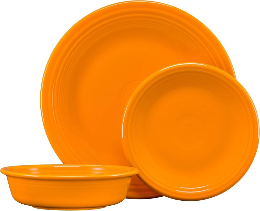
Yellow (1936-Present) – Another original color still in production, yellow’s sunny warmth makes it perpetually popular. It’s the ultimate cheerful color that brightens any table.
Medium Green (1959-1969) – Bridging the gap between light green and later greens, this bright, true green has a dedicated following among collectors who appreciate its vibrant, optimistic tone.
For the complete story of every Fiesta color ever made, including production dates and historical context, explore our comprehensive Fiesta Colors Guide: Every Hue Released Since 1936.
Modern Favorites: Most Popular Post-86 Colors
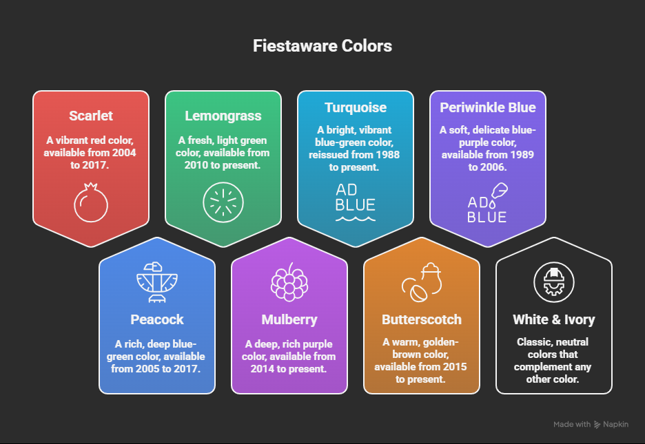
Scarlet (2004-2017)
When Homer Laughlin introduced Scarlet in 2004, collectors finally got what they’d been requesting since 1986: a true, vibrant red without the orange undertones of earlier formulations.
Scarlet quickly became one of the best-selling modern colors, maintaining strong sales throughout its 13-year production run.
What made Scarlet so popular? It captured the spirit of the original red while being completely lead-free and safe for everyday use.
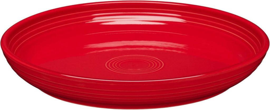
The color was bold enough to make a statement but worked harmoniously with both vintage and modern colors.
Its discontinuation in 2017 only increased demand among collectors who had put off buying Scarlet; they suddenly scrambled to find pieces, and secondary market prices immediately climbed.
Today, Scarlet remains one of the most sought-after discontinued post-86 colors. Its relatively recent discontinuation means pieces are still available, but prices are steadily rising as supply diminishes.
Peacock (2005-2017)
Few modern Fiesta colors achieved the cult following of Peacock. This stunning teal-blue perfectly captured the 2000s design zeitgeist when teal, turquoise, and aqua tones dominated home décor. Peacock wasn’t just a color; it became a phenomenon.
The shade’s popularity was so intense that when Homer Laughlin announced its retirement in 2017, collectors panicked.
Online forums buzzed with “Peacock hoarding” confessions. Retailers sold out within days.
The color’s perfect balance between blue and green, its jewel-tone depth, and its versatility in both contemporary and eclectic settings made it irreplaceable.
Peacock worked beautifully as a solo color or mixed with white, ivory, chocolate, or sunflower. It brought sophistication to casual dining and worked equally well in formal settings.
Post-discontinuation, Peacock pieces command premium prices on the secondary market, with some items selling for 2-3 times their original retail value.
For many collectors, it represents the pinnacle of post-86 color design.
Lemongrass (2010-Present)
Lemongrass proves that popularity doesn’t require discontinuation. This yellow-green shade has been in continuous production since 2010, consistently ranking among the top sellers.
Its appeal lies in its unique position as both a modern color and a vintage tribute—it echoes the spirit of original chartreuse while being distinctly contemporary.
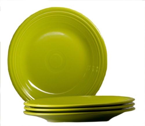
The color works exceptionally well in modern farmhouse, cottage-core, and Scandinavian-inspired interiors. It’s cheerful without being childish, bold without being overwhelming.
Lemongrass mixes beautifully with white, gray, turquoise, and even bolder colors like scarlet and mulberry. Its versatility makes it a smart choice for collectors who want pieces they’ll actually use daily.
Interior designers particularly love Lemongrass for spring and summer table settings, but its year-round appeal keeps it in Homer Laughlin’s permanent collection.
It’s become one of those rare modern colors that feels destined to achieve long-term classic status.
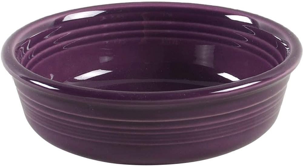
Mulberry (2014-Present)
Mulberry represents the sophisticated end of Fiesta’s color spectrum. This deep, rich purple-red brings jewel-tone elegance to the typically bright and cheerful Fiesta palette.
Since its 2014 introduction, Mulberry has maintained impressive sales figures and developed a devoted following among collectors who prefer deeper, more refined shades.
The color appeals to multiple demographics: vintage collectors appreciate its richness reminiscent of 1950s plum tones, modern collectors love its contemporary sophistication, and practical users value its ability to hide stains while still being interesting.
Mulberry works beautifully with neutrals like white, ivory, and slate, but also creates stunning combinations with lemongrass, butterscotch, and peacock.
What’s particularly impressive about Mulberry’s popularity is its staying power. In an era where Homer Laughlin regularly rotates colors, Mulberry’s continued production signals its status as a modern classic.
It’s the color that proves Fiesta can be elegant and refined while maintaining its playful spirit.
Turquoise (Reissued 1988-Present)
When Homer Laughlin reissued turquoise in 1988, just two years after Fiesta’s revival, they proved they understood what collectors wanted.
The modern turquoise captures the spirit of the vintage 1937-1969 version while using updated, lead-free glazes. Its continuous availability since 1988 demonstrates an enduring popularity that spans generations.
The reissued turquoise allows collectors to bridge vintage and modern pieces seamlessly.
You can set a table mixing 1950s vintage turquoise with brand-new 2024 production, creating a timeless look that spans eight decades.
This versatility, combined with the color’s inherent beauty and nostalgia factor, keeps it in Homer Laughlin’s permanent collection.
For new collectors, modern turquoise offers an affordable entry point to the color that defines Fiesta for many enthusiasts.
For vintage purists, it provides everyday-use pieces that complement their rare vintage turquoise treasures kept safely in display cabinets.
Butterscotch (2015-Present)
Butterscotch represents the modern neutral, a warm, caramel-toned beige that brings sophistication without sacrificing personality.
Since its 2015 introduction, this color has become increasingly popular as design trends shifted toward warm, organic tones and away from the cool grays that dominated the early 2010s.
The color works as both a base and an accent. It pairs beautifully with white for a clean, Scandinavian look; with turquoise or peacock for vibrant contrast; or with mulberry and slate for a rich, layered aesthetic.
Butterscotch particularly appeals to collectors embracing farmhouse, cottage, and rustic design styles where warm neutrals dominate.
What makes Butterscotch stand out from other neutrals is its depth; it’s not boring beige.
The color has complexity and warmth that make it interesting enough to collect while being neutral enough to work with everything.
As design trends continue favoring warm, earthy tones, Butterscotch’s popularity shows no signs of waning.
Periwinkle Blue (1989-2006)
Though discontinued nearly two decades ago, Periwinkle Blue remains one of the most beloved and sought-after post-86 colors.
This soft, lavender-blue shade defined 1990s Fiesta for many collectors and continues to generate strong demand on the secondary market.
Periwinkle’s appeal lies in its romantic, gentle quality. It’s the color equivalent of a soft watercolor painting—soothing, pretty, and endlessly versatile.
The shade worked beautifully with white, rose, yellow, and sea mist green during its production years, creating tablescape combinations that felt fresh and modern in the ’90s but have aged into lovely vintage charm.
The growing 1990s nostalgia trend has only increased Periwinkle’s popularity. Millennials who grew up with Periwinkle Fiesta in their family homes now seek it for their own collections.
Its discontinued status means supply is limited, driving prices steadily upward. Complete place settings in excellent condition can command premium prices, making it one of the most valuable post-86 colors.
White & Ivory: The Ultimate Mixers
While they might seem boring compared to vibrant hues, white and ivory consistently rank among the most popular Fiesta colors, and for good reason.
These neutrals serve as the foundation for countless collections, providing flexibility and sophistication.
White (1986-Present) brings modern, clean versatility. It’s the perfect background for showcasing colorful accent pieces, works in any decorating style, and never goes out of fashion.
White Fiesta appeals to minimalists, maximalists, and everyone in between because it adapts to any aesthetic.
Ivory (Original: 1936-1951, Post-86: 2009-2017) offers warm, vintage charm. The slightly cream-toned neutral feels softer and more romantic than stark white, making it particularly popular with vintage enthusiasts and collectors seeking a cohesive look across eras.
Both colors prove that popularity isn’t always about being bold—sometimes it’s about being the perfect supporting player that makes every other color look better.
Need help creating stunning combinations with these popular colors? Check out our detailed guide on how to mix and match Fiesta Dinnerware Colors.
Why These Colors Dominate
Looking across both vintage and modern popular colors, several common themes emerge that explain their enduring appeal:
Versatility Wins
The most popular colors, turquoise, cobalt, white, scarlet, and lemongrass, share one critical trait: they play well with others.
Collectors can confidently buy these colors knowing they’ll work with future additions. Versatile colors reduce decision fatigue and increase satisfaction because they integrate seamlessly into existing collections.
Colors that only work in specific, limited combinations tend to have smaller, more niche followings. The popular colors succeed because they’re adaptable across decorating styles, seasons, and companion colors.
Emotional Connection Matters
Every popular color evokes strong feelings. Turquoise conjures 1950s nostalgia and poolside summers. Cobalt feels bold and confident.
Peacock brings sophisticated, jewel-toned luxury. Rose offers gentle romance. These emotional connections transcend mere aesthetics; they tap into memories, aspirations, and personal identity.
Collectors often describe their favorite colors in emotional terms: “Turquoise makes me happy,” “Scarlet energizes my kitchen,” “Mulberry feels elegant.”
These emotional bonds create loyalty that survives design trend cycles and keeps certain colors perpetually popular.
Design Trends Create Momentum
Colors often achieve popularity by perfectly capturing their cultural moment. Chartreuse embodied 1950s atomic-age optimism.
Peacock rode the 2000s teal wave. Butterscotch benefits from current warm-neutral trends.
When a Fiesta color aligns with broader design movements, it gains momentum beyond the collector community and enters mainstream popularity.
Interestingly, colors that capture their era can maintain popularity long after trends shift. Chartreuse remains beloved not despite being dated, but because it authentically represents its time.
The nostalgia factor becomes part of the appeal.
The Sweet Spot of Accessibility
The most popular colors typically balance desirability with availability. Ultra-rare colors might be valuable, but they’re not “popular” in the sense of widespread collecting.
Similarly, colors that are too common lack the excitement that drives passionate collecting.
Popular colors sit in the sweet spot: attainable enough that collectors can realistically build complete sets, but special enough to feel like treasured finds.
Vintage turquoise exemplifies this perfectly. Its 32-year production run means pieces exist, but finding them still requires effort and creates satisfaction.
Curious about which colors crossed the line from popular into truly rare? Our guide to Discontinued Fiesta Colors and Rare Shades explores the most elusive hues and their current market values.
Color Popularity by Collector Type
Not all collectors prioritize the same colors. Understanding which colors appeal to different collecting approaches helps you identify where your interests align:
For Vintage Purists
These collectors focus on pre-1973 pieces and prioritize:
- The Original Five: Red, cobalt, light green, yellow, ivory
- 1950s Colors: Chartreuse, rose, forest green, gray
- Turquoise: The vintage holy grail
- Medium Green: The bridge between eras
Vintage purists often prefer colors with historical significance and authentic age. They value patina, crazing, and the tangible connection to Fiesta’s early decades.
For Modern Collectors
Contemporary collectors gravitate toward:
- Current Production Favorites: Lemongrass, mulberry, butterscotch, turquoise
- Recently Discontinued: Scarlet, peacock, ivory
- Bold, Saturated Colors: Whatever’s newest and most vibrant
- Limited Editions: Exclusive retailer colors
Modern collectors appreciate lead-free formulas safe for daily use, contemporary color palettes that match current décor trends, and the thrill of collecting colors while they’re still available.
For Mix-Era Collectors
These versatile collectors blend vintage and modern, preferring:
- Cobalt Blue: The ultimate bridge across all eras
- Turquoise: Both vintage and modern versions
- White/Ivory: Timeless neutrals
- Complementary Pairings: Vintage chartreuse with modern lemongrass, vintage rose with modern mulberry
Mix-era collectors value cohesion across time periods and appreciate how Fiesta’s design consistency allows seamless blending of pieces from different decades.
For Investment Collectors
Those focused on value appreciation seek:
- Limited Editions: Lilac, heather, chocolate, sapphire
- Recently Discontinued Popular Colors: Peacock, scarlet, periwinkle
- Original Five Vintage: Especially red
- Complete Sets in Rare Colors
Investment collectors research market trends, track auction prices, and strategically acquire colors likely to appreciate. They often store pieces mint in the box rather than using them.
For Everyday Users
Practical collectors who actually use their Fiesta prioritize:
- Currently Available Colors: Easy to replace broken pieces
- Versatile, Neutral-Friendly: White, turquoise, lemongrass
- Dishwasher-Durable Modern Glazes
- Colors That Hide Wear: Mulberry, butterscotch, cobalt
Everyday users want beautiful dishes that enhance daily meals without requiring precious-object anxiety. They value function alongside aesthetics.
Shopping Smart: Finding Popular Colors
Knowing which colors you want is only half the battle; finding them at fair prices requires strategy:
Currently Available Colors
For colors still in production (cobalt, turquoise, lemongrass, mulberry, butterscotch, white, yellow, and others), purchase through:
- Official Fiesta Retailers: Macy’s, Belk, Dillard’s, Homer Laughlin’s website
- Department Store Sales: Watch for 20-40% off during major sales events
- Online Retailers: Amazon, Wayfair (verify seller authenticity)
Current production colors typically cost $8-$15 for mugs, $12-$20 for dinner plates, and $15-$25 for serving pieces at retail prices. Sales can reduce prices by 30-50%.
NOTE: Prices shown are illustrative examples only and do not reflect actual values.
Discontinued Popular Colors
For beloved discontinued colors like peacock, scarlet, and periwinkle:
Best Sources:
- eBay: Largest selection, but prices reflect high demand
- Etsy: Often better prices than eBay, especially from sellers clearing estates
- Estate Sales & Auctions: Best deals, but requires patience and luck
- Antique Malls: Moderate prices, chance to inspect in person
- Facebook Marketplace/Craigslist: Occasional bargains from sellers unaware of value
Price Expectations:
- Peacock: $15-30 for common pieces, $40+ for rare items
- Scarlet: $12-25 for common pieces, $35+ for rare items
- Periwinkle: $10-20 for common pieces, $30+ for rare items
Popular discontinued colors cost more than less-desired discontinued colors, but significantly less than truly rare vintage pieces.
NOTE: Prices shown are illustrative examples only and do not reflect actual values.
Vintage Popular Colors
For vintage turquoise, chartreuse, rose, and original red:
Price Ranges:
- Vintage Turquoise: $15-40 for common pieces, $60-150+ for rare items
- Chartreuse: $20-50 for common pieces, $75-200+ for rare items
- Vintage Rose: $18-45 for common pieces, $60-175+ for rare items
- Original Red: $40-100+ for common pieces, $150-500+ for rare items
Authentication becomes critical when investing in vintage pieces. Learn to spot reproductions, unmarked pieces, and condition issues that affect value.
Our comprehensive guide, ‘Identifying Authentic Fiesta Colors (Old vs. New),’ provides detailed authentication tips to protect your investment.
Building Your Collection Around Popular Colors
Smart collecting starts with popular colors because they provide a strong foundation:
Starting with Classics
Begin your collection with versatile, popular colors that mix well:
The Universal Foundation:
- White or Ivory: Your neutral base (4-8 place settings)
- Cobalt Blue: Timeless accent (2-4 place settings)
- Turquoise: The quintessential Fiesta color (2-4 place settings)
This trio works together beautifully and provides flexibility for adding any additional colors later. You can’t go wrong with this combination, whether your eventual goal is vintage, modern, or mixed collecting.
Building Out: Once you have your foundation, add popular accent colors based on your aesthetic:
- For Vintage Look: Add chartreuse, rose, or yellow
- For Modern Sophistication: Add mulberry, butterscotch, or lemongrass
- For Bold, Vibrant Style: Add scarlet, peacock, or sunflower
- For Soft, Romantic Feel: Add periwinkle, lilac, or apricot
Adding Accent Colors
Popular accent colors energize your collection without overwhelming it. Use the 60-30-10 rule:
- 60%: Neutral base colors (white, ivory, butterscotch)
- 30%: Primary accent (cobalt, turquoise, mulberry)
- 10%: Secondary accent for pop (scarlet, lemongrass, chartreuse)
This ratio creates visual interest while maintaining cohesion. Rotate your 10% accent seasonally, use scarlet in winter, lemongrass in spring, turquoise in summer, and mulberry in fall.
Mix Popular + Personal
While popular colors provide a solid foundation, the most satisfying collections include personal touches:
Don’t Just Follow Trends: If you love a less-popular color, embrace it. The joy of Fiesta collecting is creating a table that reflects your personality. Popular colors provide a base, but your unique accent colors make the collection yours.
Trust Your Eye: Popular colors are popular for good reasons, but color preferences are personal. If Peacock doesn’t speak to you despite its cult following, that’s fine. Find the colors that make you happy every time you set your table.
Balance Collectibility with Usability: Some collectors get so focused on popular, valuable colors that they never actually use their dishes.
Remember that Fiesta was designed for everyday joy. Mix popular investment pieces with affordable current-production colors you’ll actually eat from daily.
Conclusion
The most popular Fiesta colors, from vintage turquoise and chartreuse to modern peacock and mulberry, achieve their status through a combination of beauty, versatility, emotional resonance, and cultural relevance.
These colors represent the best of what Fiesta offers: affordable artistry that brings joy to everyday life.
Whether you’re drawn to the nostalgia of vintage chartreuse, the sophisticated depth of mulberry, the timeless appeal of cobalt, or the cheerful brightness of lemongrass, popular colors provide a proven foundation for building a collection you’ll treasure.
They’re popular precisely because they deliver satisfaction across years and changing trends.
But remember: your collection should reflect both popularity and personal preference.
Use popular colors as your starting point, your investment foundation, or your versatile base, then add the unexpected, the personal, and the surprising.
The most interesting Fiesta collections balance crowd-pleasing classics with unique touches that tell your story.
The beauty of Fiesta is that there’s no wrong answer. Mix eras, blend bold with subtle, combine vintage treasures with modern workhorses.
The popular colors will anchor your collection, but your personal choices will make it distinctly yours.
After all, the most popular color in your collection should be the one that makes you smile every time you see it.